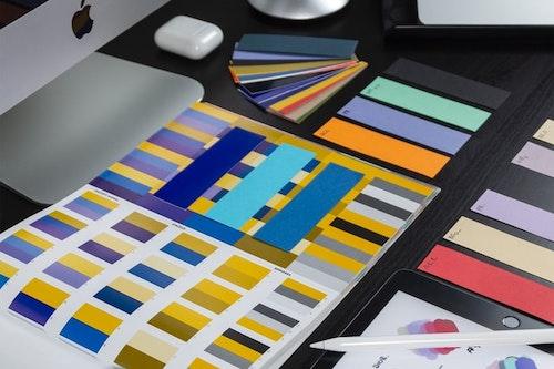
ChilledWeb work to make meaningful relationships between our Customers, their users and the portfolio of products and services that they use. We use the latest research to focus on people’s behaviour and how they interact with our Customers Websites and Applications.
Getting to a design that a Customer likes and is going to be happy with for years to come is not a simple task and will require a few iterations; however ChilledWeb are here to help and support you in any way we can.
Consistency
Users are sensitive to change and notice differences. Either consciously or unconsciously, they will always question “why is this different"?
We understand that users need to be comfortable and therefore strive for a consistent layout, font, look, feel etc
If we do not implement this consistently correctly, users will ultimately end up paying attention to the differences and this will pull focus from our Customers website and any message they were trying to convey.
Our developers allays ensure that elements that have a similar behaviour have a similar appearance (similar colour and iconography for example). This ensures that users can recognise elements instantly.
Equally as important, we ensure that different elements that have different behaviours have a different appearance.
Visibility
Users won't be engaged in our Customers website or application if they don't know interactions are available. A simple example of this is the ‘play’ icon on a YouTube video inviting users to click to play and showing clearly this is a video. Therefore we ensure that users are encouraged to engage where ever appropriate.
Our developers also keep in mind users could be viewing the same content on different devices. This can sometimes lead to ‘stranded content’. This is where a Customers message is lost because the text or image appears below the visible area of the page. We never ‘assume’ that users will see or use their scroll bar! Therefore we prototype our work on multiple devices to ensure our Customer content flows below the page and ensure users are encourage to scroll down the page.
Where appropriate our developers design to invite user interaction. We understand that users are click happy .. they will attempt to interact with anything that looks like it could be clickable, especially known standards (hyperlinks, buttons, thumbnails, scrollbars and form elements). Users typically perceive any difference in text as a link (even though it may not even be underlined). Therefore our developers will look to signal the availability of interaction with visual indicators that invite clicks or touch, buttons, icons, textures, text styles.
Learnability
ChilledWeb understand that user interactions should be both easy to learn and easy to remember. Ideally interactions should be used once, learnt once and then remembered forever.
Users take experiences with them on their journey and apply that experience to similar situations. We look to ensure that users can use what they have learnt on one page and then reuse that learnt behaviour on subsequent pages.
This design technique enables users to move from novice through to an expert user of our Customers website or application quickly. It also allows our design team to take advantage of what users already know.
We also look for ‘real world’ comparisons. We know that users learn behaviours across the internet, devices and applications. Therefore by representing objects that users are already familiar with in the real word in the online world we are able to create a space online that users find instantly familiar and easy to use.
Predictability
Design should set accurate expectations about what will happen before the interaction has occurred.
Our designers are constantly looking to eliminate the need for users to be randomly clicking anywhere and everywhere expecting the website or application to do something.
We constantly look for opportunities to support the users journey, providing labels and subtle clues to guide the visitor around our Customers website or application.
Feedback
Obtaining feedback should always compliment a users experience and not complicate it (or slow the user down). Users should be given an opportunity to undo or reverse any choices they’ve made and where possible correct any mistakes.
Every interaction a user has with our websites or application should have a noticeable reaction, confirming to the user that something has happened (or is happening), constantly managing their expectations.
Further, we ensure that interactions are acknowledged to users to let them know something has been done. This helps cut down on users constantly clicking and reduces any confusion.
Summary
We always keep in mind that we are designing for our Customers and their users, ensuring interactions and outcomes are clear, consistent and predicable with feedback where necessary.
Further, part of our design process includes prototyping and website and application previews to set Customer expectations, so our Customers can see the engaging experience we are building for their users and provide feedback for us to action.
If you would like to know more about how ChilledWeb can take your businesses online profile to the next level then please get in touch!